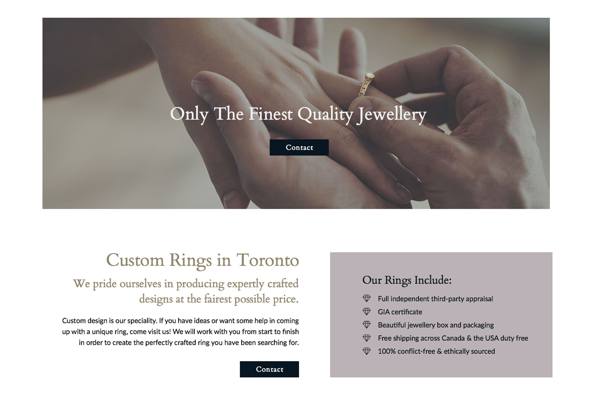
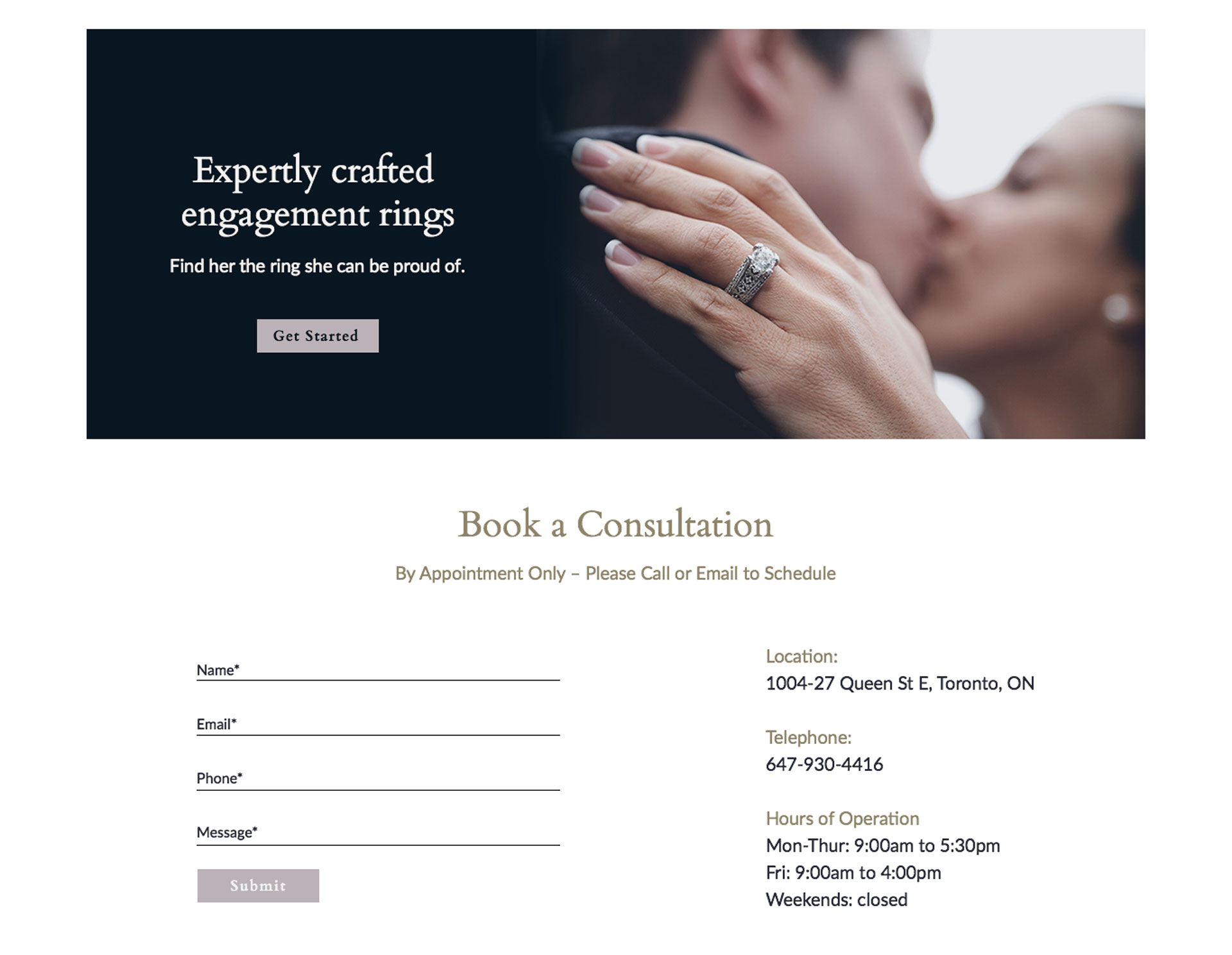
We loved this project! Imagine telling your two graphic designers, Clara and Julie, that they get to design a jewellery store website!
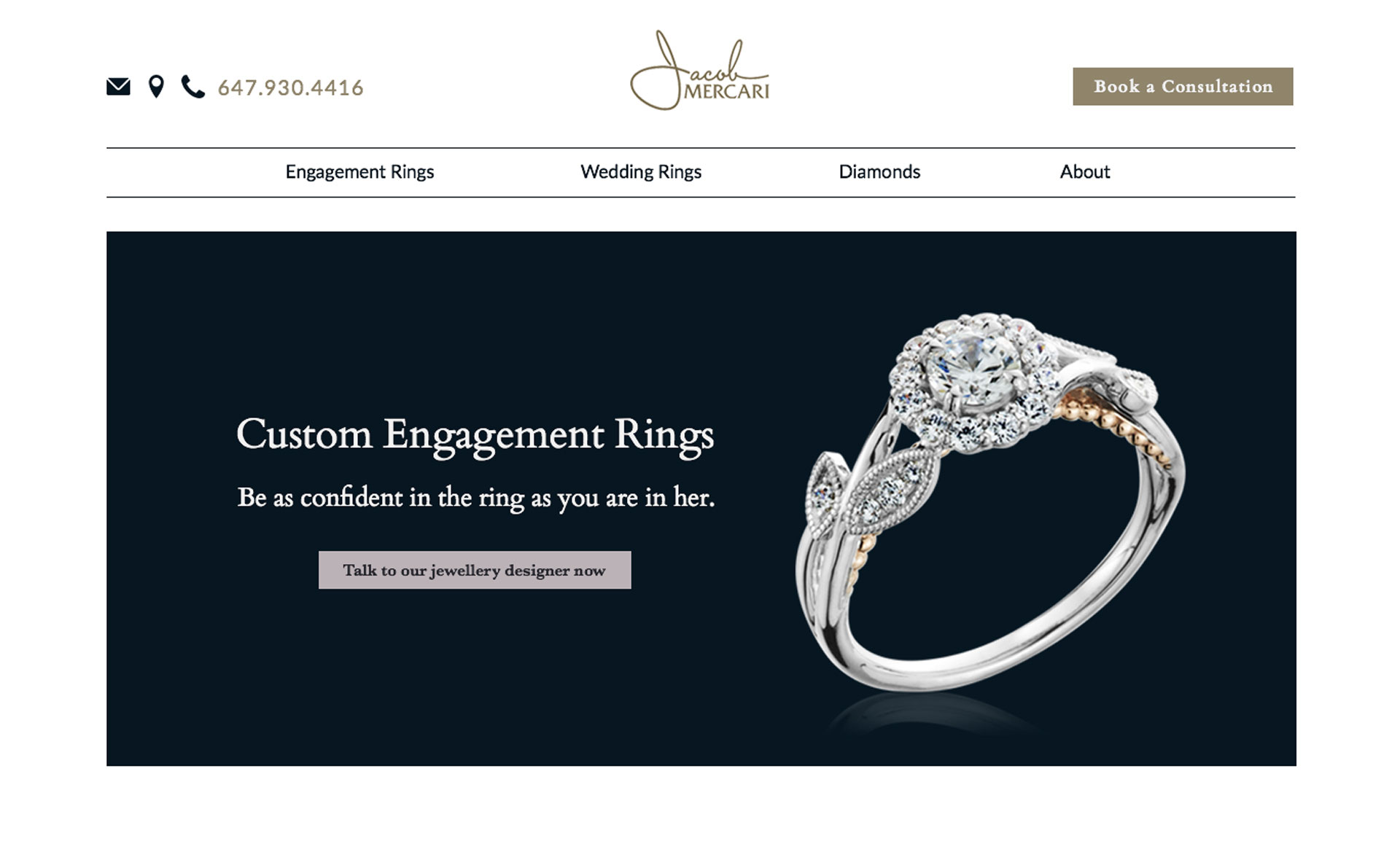
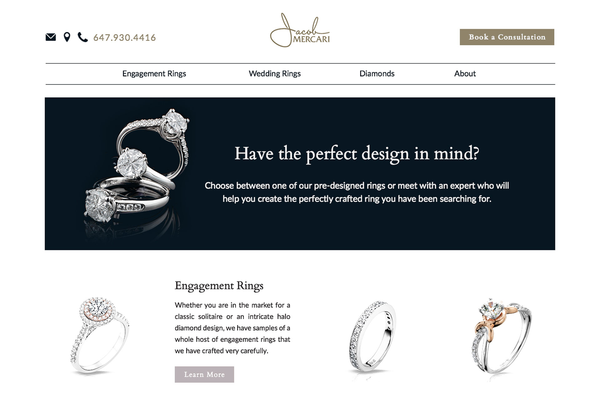
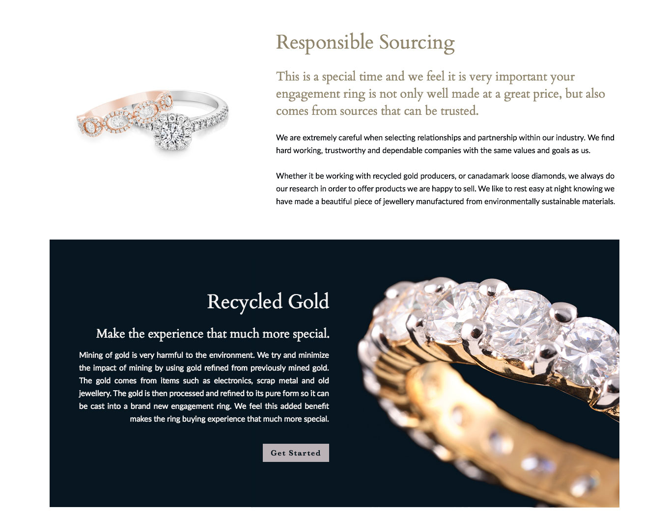
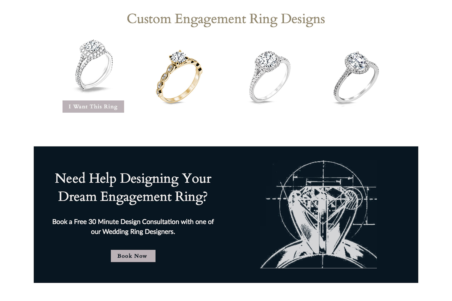
We tried to keep to a simple, luxe design with dark background shots of the rings to accentuate them as visual heroes on the page. We also made sure to design with conversion in mind as this is an e-commerce store. We created Top Of Funnel (TOFU) and Middle Of Funnel (MOFU) Calls To Action (CTAs) down the page for those not ready to buy yet.
The site was built by another agency. The client had signed a contract with them but then didn’t like their initial designs, so came to us for design only.

