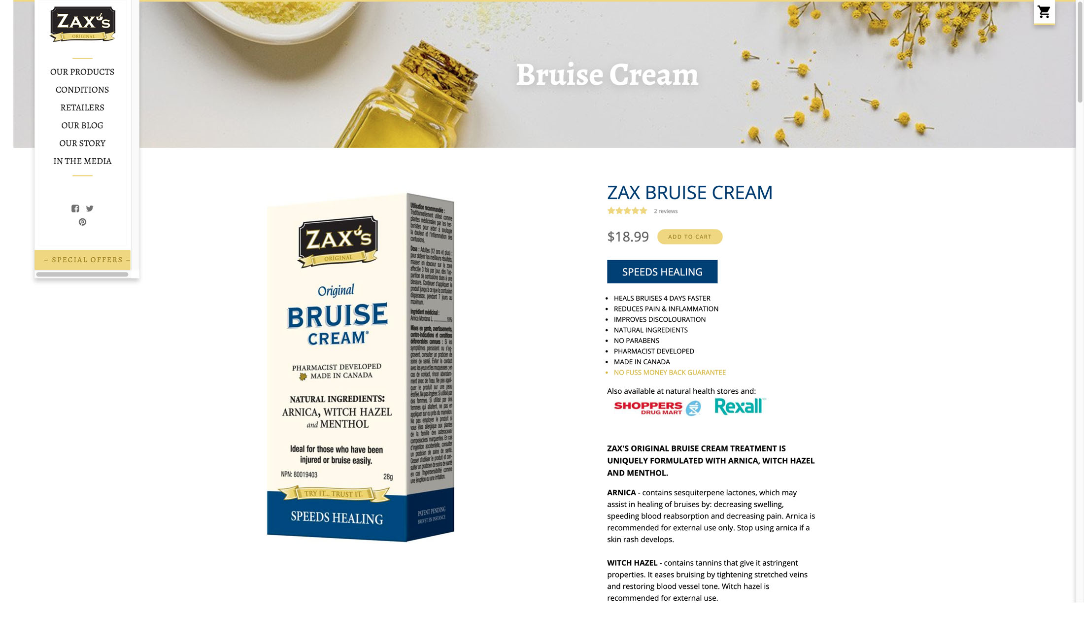
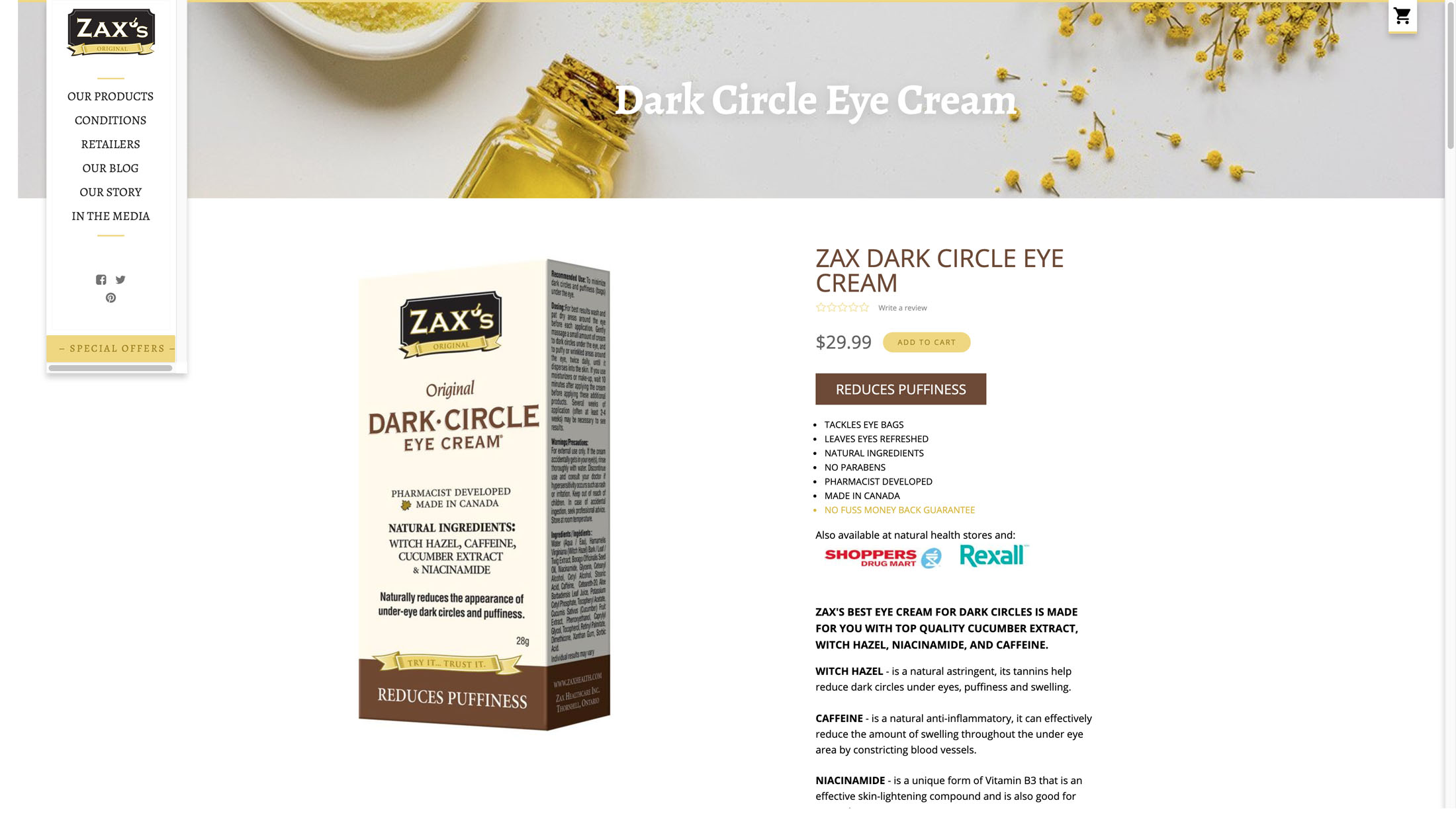
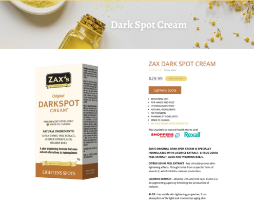
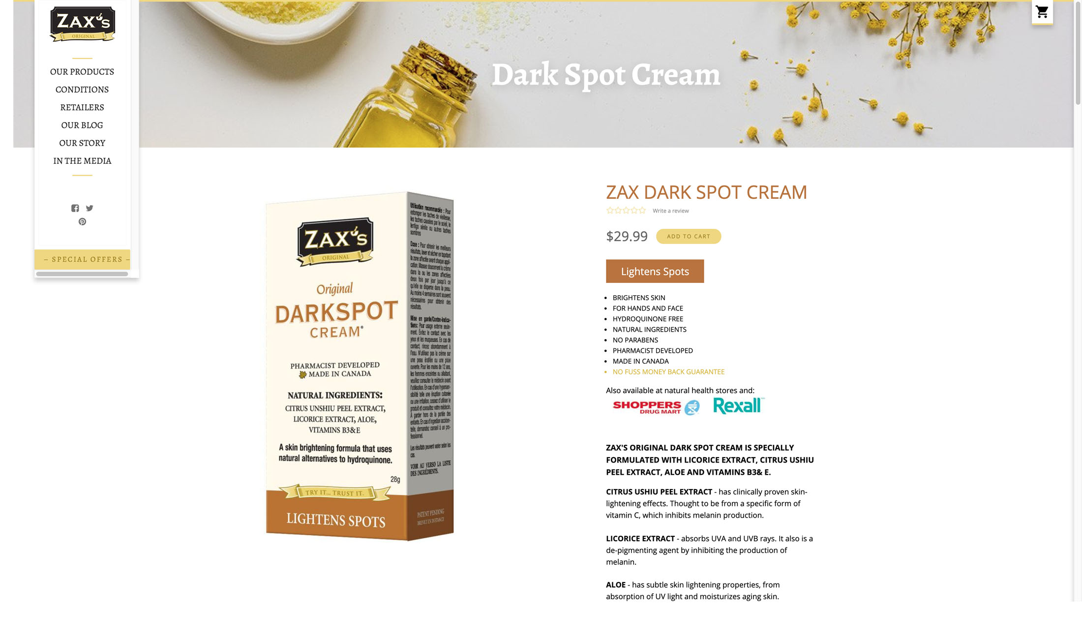
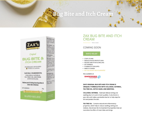
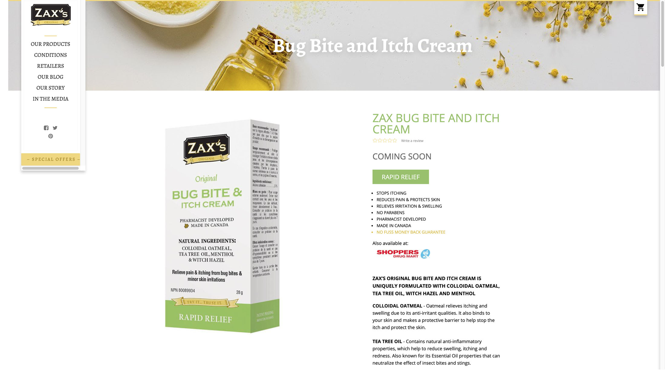
This portfolio example illustrates our work optimizing e-commerce product pages for Zax Health of Toronto.
THE ISSUE:
The former page design hid many of the key elements within accordion tabs. The key benefits of the product were hard to find.
OUR APPROACH TO E-COMMERCE OPTIMIZATION:
We redesigned the product page in Shopify following best practices:
- We put a large, colour coded main benefit callout below the price (i.e. Speeds Healing).
- We added reviews.
- We added a list of benefits. Formerly these were listed on the product image only.
- We prominently showed the two well-known retailers that carry the product as social proof.
Site: Zax Health

